Seeing the world through my illustrations
Re branding series.
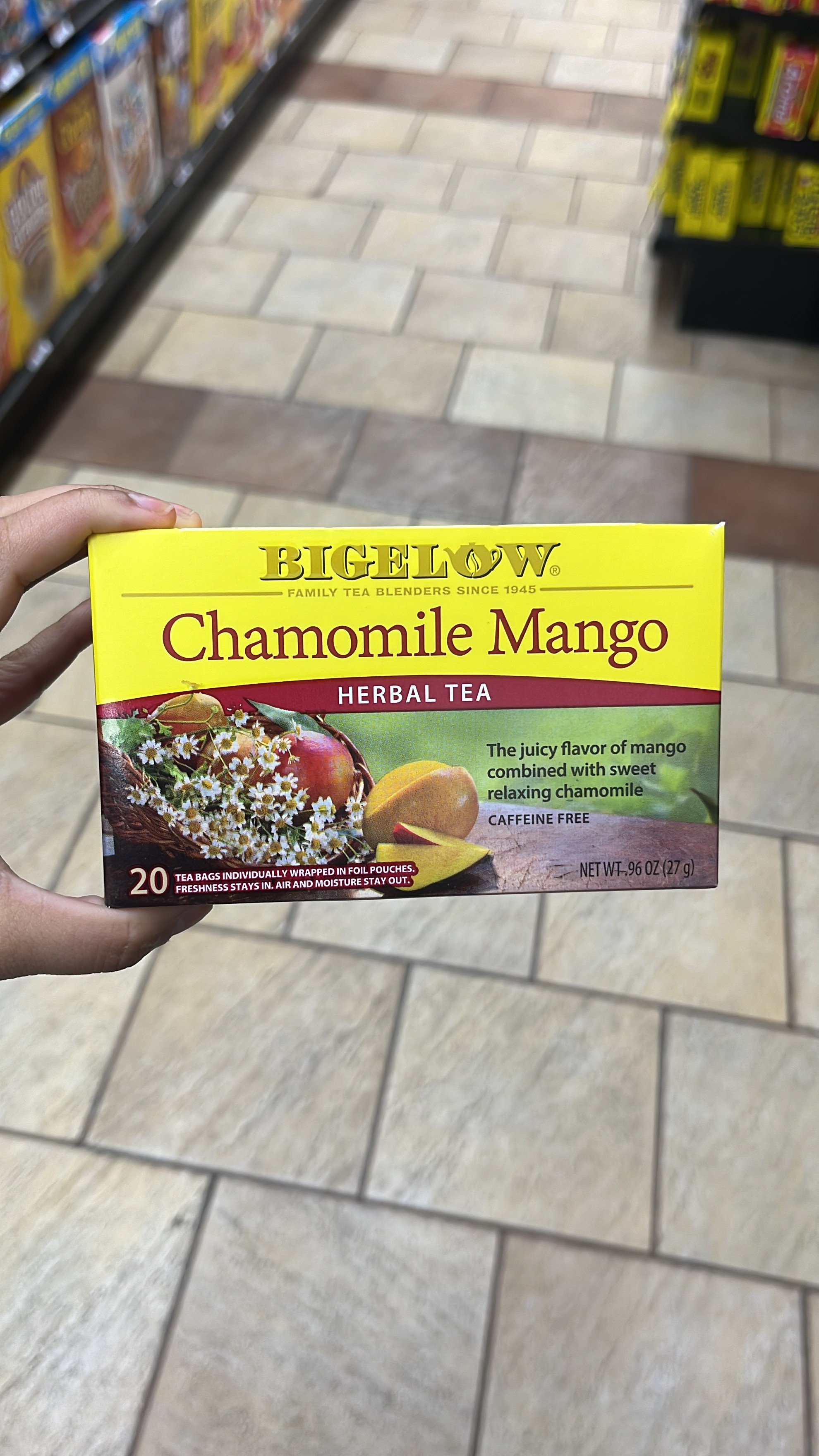
CONCEPT:
This chamomile tea had a very interesting flavour but the packaging did not convey it clear enough.
DESIGN ALTERATIONS:
Replaced the yellow on yellow logo with a darker colour variant from the brand.
Illustrated the main elements to make them look more attractive.
Centre aligned all the text.
Reduced the number of fonts and font sizes.
IMPACT:
The overall design looks more balanced and clear. The eye flows naturally through the information, making the product seem more convincing to the consumer.
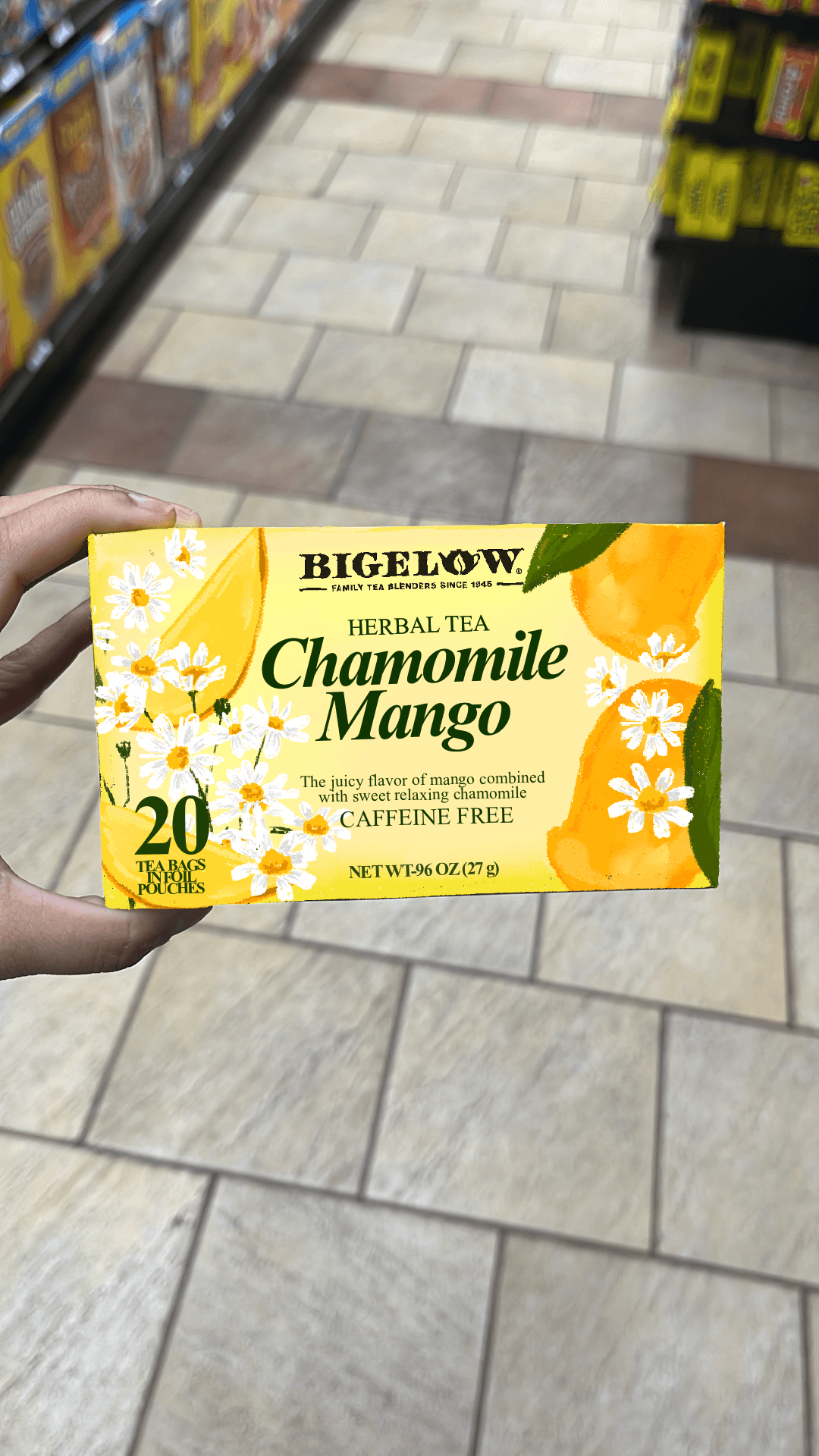
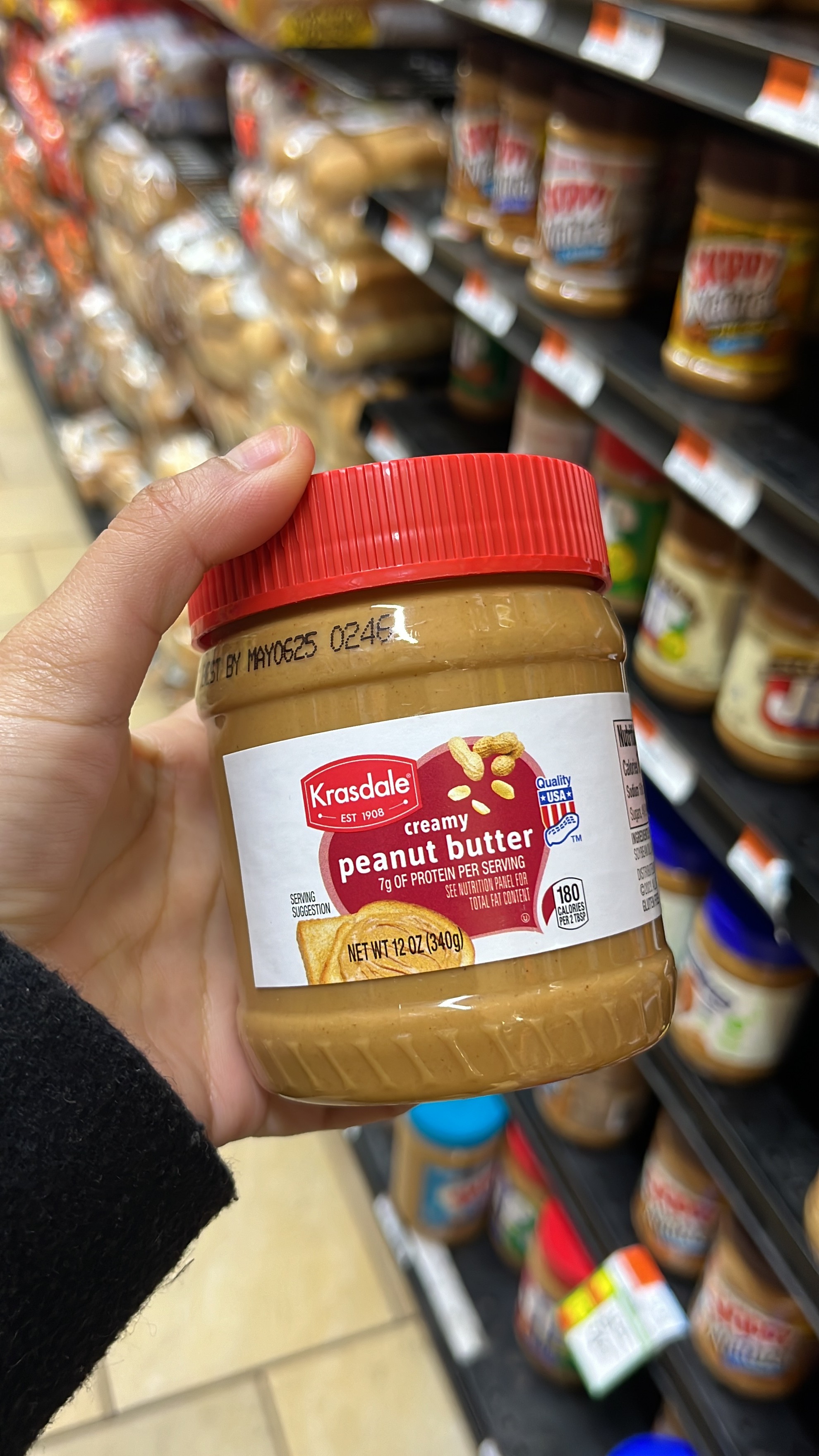
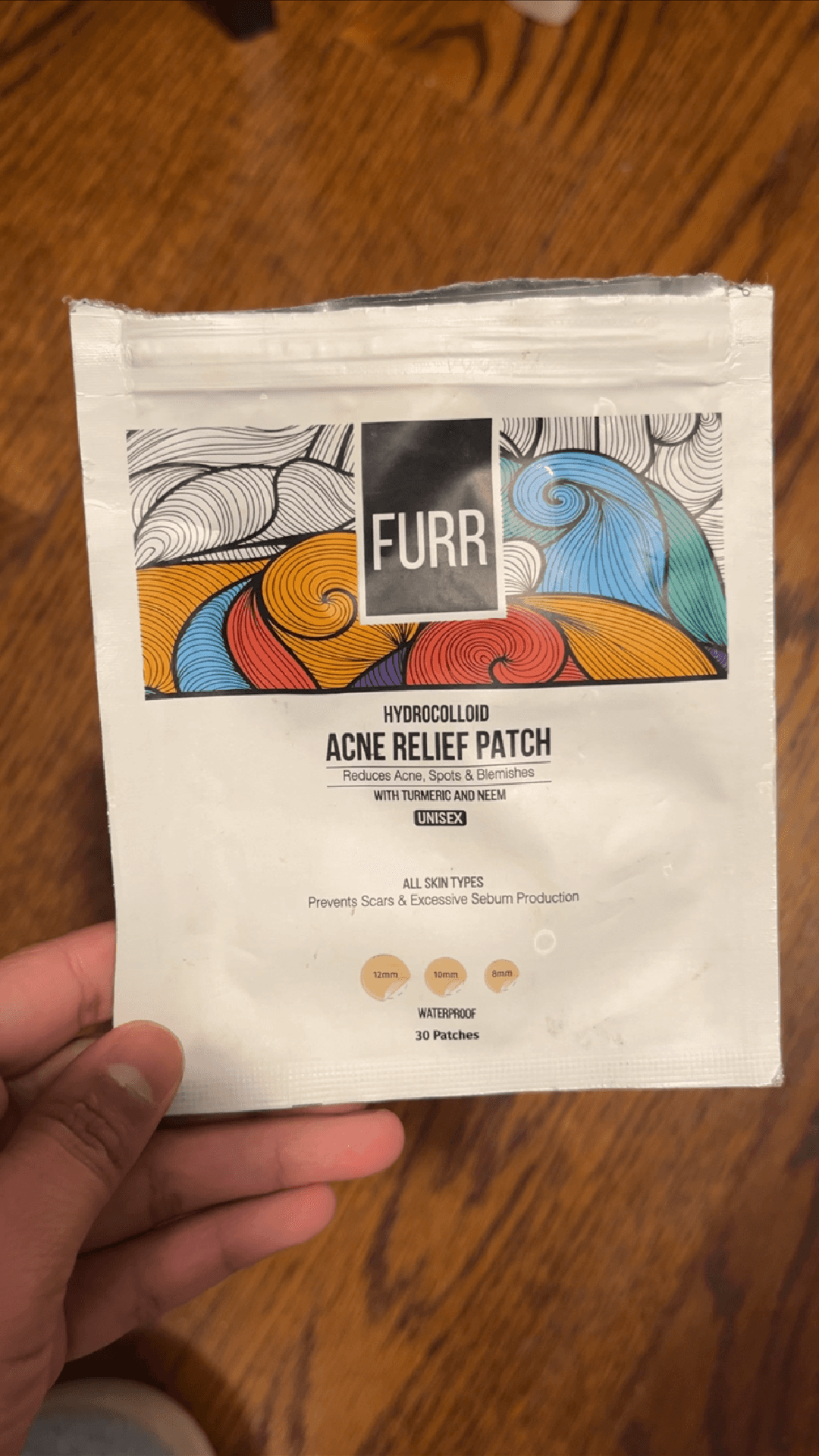