CATEGORY:
Brand STRATEGY
SERIES FOCUS:
PACKAGING DESIGN
Format:
Illustrated Videos
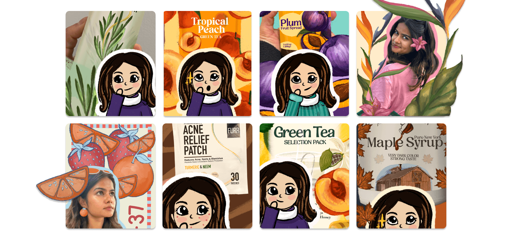
In supermarkets, products often have only two seconds to catch a customer's eye—packaging design becomes the critical deciding factor. Through these redesign reels, I strategically transform ordinary product packaging into lively, visually engaging designs. My goal is simple: create packaging that captures attention instantly and boosts shelf presence.
Quick Links
Click to jump on project sections:


#1
This redesign illustrates the importance of designing a component of a product keeping in mind the whole ecosystem, and how everything would fir together at the end.

What was wrong with the existing design?
The existing label design had too many fonts in a small area. The logo wasn't legible at all over the patterned design, that further competed with the texture of the product inside the bottle. With a choice of colour that didn't go with the product either, the overall design seemed unfitting.

Redesign explained:
My version of the label thoughtfully incorporates both the colour and the texture of the product inside the bottle. Using complimentary colours, and making the label plain so that it doesn't clash with the textured product, overall design looks more balanced.
Watch the quick video version:
#2
Clear and appropriate representation of the ingredients or the product leads to comprehension of the product. This leads to a better and faster decision making in the supermarket.

What was wrong with the existing design?
The original label lacked clear visual representation—the aioli garlic and mustard flower were indistinct, causing confusion for customers about the product's key ingredients.

Redesign explained:
I created clear, prominent illustrations highlighting the main ingredients, aioli garlic and mustard flower, and balanced the composition. This resulted in a much clearer, visually appealing design that immediately grabs attention on the shelf.
Watch the quick video version:
#3
Not every brand aims for a premium feel, but it’s fascinating how minor adjustments in typography and layout can rebalance the design and elevate a product’s entire presence.

What was wrong with the existing design?
The original label was bright and playful, but lacked elements that communicated a premium feel, potentially limiting perceived value.

Redesign explained:
I created clear, prominent illustrations highlighting the main ingredients, aioli garlic and mustard flower, and balanced the composition. This resulted in a much clearer, visually appealing design that immediately grabs attention on the shelf.
Watch the quick video version: